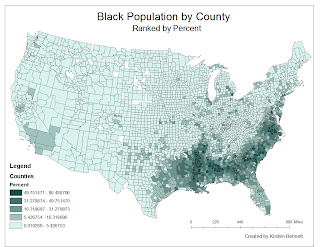
This graph represents the percentage of African Americans living in each county in the United States. The darker green represents a higher percentage of blacks- this higher percentage is clustered in the South. There is also a trend of increased percentage surrounding the Mississippi River. The census shows that there are counties in the Midwest in which the population of African Americans is zero.
This map is the percentage of Asians per county. Here dark purple represents a higher percentage. America's Asian population tends to be on the west coast, mainly in California. Here there are also counties in which the population of Asians is zero, but not as many.
This map shows all other races that represent a significant percentage in a county. Dark red is a higher percentage. This map clearly shows a trend toward the the south western United States, ranging from Texas to California to Washington.
Each of these maps show the trend of immigration into the United States. The black population mainly arrived from Africa in America's early history to work on plantations in the South. For this reason, African American population is still centered in the South. Since Asia is located to our west, is is logical that most Asians would settle in California. Also, from the "Other" Race Population map, it would be logical to conclude that "other" includes people of Hispanic origin because the deepest red is centered near the Mexican border.
One other important aspect to note is that for counties in which the population is labeled as zero, this means that there are no people of that race reported as living there. This can mean either that there are no people of that race living in that county, or that no people of that race responded to the census.
(These maps were created from census data from 2000)
In this quarter I have learned that GIS is a useful tool that can be applied to many different fields. I create raster maps for the research that I am a part of, and it was extremely enlightening to learn to use a different program to create different types of maps. GIS is a helpful program, partly because it is so user friendly. At the touch of a button, you can reposition your data or create an aesthetically pleasing map. Also, all the data about your map is stored within the map so you can easily compare percentages or locations of schools. Overall, my opinion of GIS is very positive, and I would be interested in learning more about it!


